Designing with responsiveness in mind
I came across this great article on the rise of responsive logos on Just Creative. I find myself more and more approaching brand development with this kind of thinking. It’s impossible to create a logo in isolation. You always have to consider how this logo will be applied on various platforms. A great logo is flexible and adaptable. Have a look at the logo I did for Migrate Films as an example of a brand having multiple elements that can be used differently, depending on its application.
———————-
Article by Evan Brown.
In a chaotic time of brands revamping their logos, minimalism on the rise, responsiveness being the new sexy, designers lead on by the mantra of “less is more”, we can only wonder; what is the design world coming to?
The Essence of Responsive Logos
To provide a comprehensive user experience across multiple mediums, a true responsive design isn’t limited to context or shrinking content on a page. Subtle design considerations, such as the icons and logos should also be flexible enough to follow similar contextual responsive principles.
A few years ago, this crazed, demented talk of altering a logo would have been dubbed as a design taboo, earning you the wrath of the holier-than-thou branding moguls. But today, with a probability that a company will use its logo on anything from a mammoth billboard to a tiny smart watch, the initial shock at the scandalous “responsive logo” idea is wearing off.
Adapting Logos in a Responsive World
With the proliferation of mobile-friendliness taking the web by storm, logo designers are finding it more and more vital to make their vectors adapt to any and every user’s screen size, so that the company logo isn’t stripped of its inherent meaning or essence when rendered on myriad resolutions. Since logos are the cornerstone of branding, it’s only natural to hardwire them to cater to the responsive web space.

For this concept to take root, a brilliant logo is a prerequisite; something that can perfectly embody a brand’s values in a simple image. This challenge of creating something that continues to speak volumes about a brand, regardless of the device used for accessing a website, is a tough nut to crack.
Let’s take a look at how you can design scalable logos without losing the very personality of your brand.
Design for Simplicity
The biggest dilemma of non-responsive logos is that they are overcomplicated; downright ridden with detail and intricate subtleties.
In a post by Matthew Fidge on Just Creative, many people abhor to see logos as just a visual hook. They want their logos to be the bearer of organizational tradition and brand values. However, having too many elements only makes it harder to let go of a particular one, and any attempt to fit it into a smaller space ends up in a design nightmare.
The logo of Olive Garden, despite being attractive on its own, offers the perfect design conundrum. Who would have the heart to strip the beautiful and large word mark of its whimsical leaves without wreaking havoc on the design?
On the other hand, there is no way to render the entire logo on a smaller screen, without it ending up in a big, messy, colorful blob of indecipherable hocus-pocus!

Source: Olive Garden
Lasting graphic design ideals of simplicity and clarity have become the new norm as logo designers hustle to create logos that remain clear at different sizes, load quickly, scale elegantly, and have the maximum impact.
This means that the trends of glows, complex illustrations, color gradients, drop-shadows, and other graphical tropes have been shunned for a cleaner aesthetic, replacing superfluous decoration with more focused forms.
Cutting down the level of detail in a logo leads to greater legibility at small sizes. Outlined elements could be filled in and inverted, gradients can be flattened, illustrations redrawn into tract graphical shapes, thin strokes can be made thicker, and detailed shapes can be smoothed out. Hence why flat design has become so popular.

A great example is the recent logo redesign of MasterCard. Simplified and modernized, the new brand identity of MasterCard is optimized to be adaptable across an increasingly digital world.
The new logo says goodbye to the flat drop shadow on the overlapping circles and the ill-fitting condensed sans serif wordmark. The logomark can be used on its own on smaller resolutions without losing its recognizability.
Here are some logo redesigns that are a testament that less is more!

Design for Versatility
All astute logo designers know the prudence of creating versatile designs that stand the test of time.
When we talk about responsiveness, we are thinking about quality, legibility, and adjustments of the design. The example of Disney in designer Joe Harrison’s project “responsive logos”, shows how a logo can be simplified to confirm to various screen sizes without losing its identity.
Although it is bared of the castle element, “Walt Disney” name is enough to incite emotions attached to the brand name in the audience. Narrowing down the browser size, “Disney” is an even simpler rendition of the brand name. Since the “D” of Disney is a distinct mark, the logo is further narrowed down to its bare essentials needed to recognize the brand.

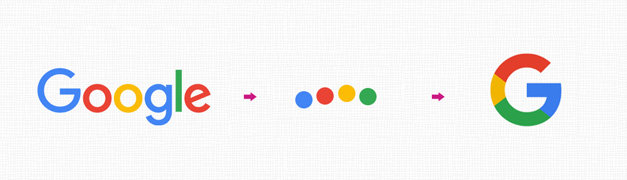
Google also chose to jump on the bandwagon and transformed its logo, converting the simple, blue “G” into a letter that attributed to all the colors of the original logo, leaving no doubt as to what the logo represents.
Declutter, Minimize, Reduce Detail
Despite what people believe, brand identity and recognition are not affected when minor or small adjustments are made to a logo due to physical constraints. Here are a few ideas to scale logos effectively:
INCREMENTAL REDUCTION

As obvious from the examples of Joe Harrison’s experiment, you don’t have to make a drastic change to your logo at the smallest alteration in screen size.
For logos with small type features especially, incrementally eliminating the small type can work wonders.
DITCH THE WORDMARK

When displayed in a narrower browser, Hubspot readily parts with its wordmark. They understand that a simple icon lets users concentrate more fully on the experience and content, and is less distracting. Domino’s is also quick to shed its wordmark on smaller resolutions since its logomark is distinguishable enough on its own.
SIMPLIFY THE LOGO
If the logomark of a company is intricate enough to pose the threat of turning into a blurry blotting mess at smaller resolutions, or if the company would be better identifiable with its wordmark, it’s better to let go of the logomark to simplify the logo; just as Pizza Express has done perfectly.
ABSTRACT ON POINT

If your company has a detail-oriental logomark or ornate lettering, yet you want to retain the logo without shedding any element, a great way is to make the imagery more abstract.
This ensures that the logo is clealry visible on smaller screens, just like Jaguar has done! Since the chrome effect in the original logo is hard to scale down, the alternate version retains the necessary details needed to recognize the logo.
VERTICAL STACKING

Vertically stacking the logomark and the wordmark is a simple way of adapting a logo to design constraints. While the side-by-side logo works best for bigger devices, the vertically stacked logo takes up much less space at smaller resolutions without taking away any element from the logo.
Future Proofing Logos
One of the greatest benefits of responsive logos is that they maintain their legibility at all screen sizes, without having to contend with an ultra-minimal style, even when displayed at larger sizes.
Responsive design allows logo designers to fine-tune icons to portray the “sweet spot” related to legibility across multiple resolutions. Since these logos are designed to display varieties of detail according to the device they are displayed on (and there are plenty of screen sizes available), the fluidity of responsive icons guarantees that they are already optimized for new devices.
Bring it on technology; our logos are all equipped for the battle!
Article via Just Creative
Evan is an author and an expert in digital marketing. He works with DesignMantic, a DIY logomaker tool. He is a staunch believer in the fact that a great logo builds a business up from scratch and it can be a game-changer for brands seeking recognition online. He tweets frequently at @EvanBrownDM.